Sunday, April 26, 2009

Oh, Manifesto.

Dear Readers (or just George. If he even stills reads this...),

As we near the end of Spring Semester, I regret to inform you that The New Small Talk has failed on its promise to replace newspapers. Perhaps that was a ridiculous promise to begin with (as was most of the original manifesto), and I hope no one was stupid enough to believe it. I have composed a list of contributors to the failure of this blog:

1. Lack of dedication -- daily updates are in fact daily. I have somewhat of a life.

2. Copyright laws -- they're a bit scary. I became afraid to steal images. I considered drawing my own in MS Paint, but I'm no artist. And I couldn't paparazzi any photos... celebs just don't come to Manassas all that often anymore.

3. Jessica Simpson -- because really, can't everything be blamed on her?

4. For the Love of Ray Jay -- I may have never made a post about it, but wasn't that just the breakout television series of the year? Danger, she smashed the homies. Anyway, perhaps I spent too much time watching that instead of writing about it.

5. The superficial is just better -- thesuperficial.com

6. Dina Lohan fell off the map. Where has this psycho been lately? It was hard to make fun of crazy moms when her and Lynne Spears went MIA.

7. Jessica Simpson -- when isn't she a hot mess? Doesn't that make the Hot Mess of the Week award useless? 

I could go on forever, but what is the point? No matter the reason, The New Small Talk has failed its readers. I set out to make celebrities more tolerable, and doesn't it seem like Paris Hilton has only become more annoying since I started this blog? 

We certainly didn't swiffer the nation. Our 1 person following isn't very impressive. 

However, I seem to recall that the writer of the manifesto is supposed to make outrageous claims that they later disown. So, I would like to take the opportunity to disown my manifesto. From now on, I promise nothing. That way, if I decide to post something, it will be magical and completely going above and beyond what my manifesto calls for. My posts will be so infrequent that seeing a unicorn will be more likely to happen.

George,
We gave it a good run. And it was fun while it lasted. But I think this Blogger relationship should end here. You could check back from time to time, but like I stated before, I'm not making any promises that I will even still be here. Sorry.

All the best!
KP


Monday, April 20, 2009

Group Project Critique

The group project that I was most impressed by was Facade by Justin and Shane. Their site had a great layout and was overall very well done. It seems like a lot of work went into creating their project.

What I like most about their site, and didn't even realize until just now, is that every time you go to the intro page the image changes slightly. I have no clue how they even managed to do that, but it is a really neat effect.

I also liked the type-writer idea that was used on the second page, but it does make the text very difficult to read. Perhaps it would be easier to read if the type-writer motion was slower. Making it slower would allow for the viewer to have time to read the text, and it would also make that page easier to look at; the constant motion hurt my eyes a little.

The insurgent page was executed very well. Again, this is another technique that I have no clue how to do, but it is really interesting. I especially liked that they didn't just use this technique just to use it, but they made using the technique relevant by relating to the first line of the text. At first I thought random parts of the text "explode" and then reappear, but upon playing with their site, I realize that only the text that I hover over with the cursor are affected. I like that the user has control over this page in a sense, and the effect isn't just a code that "explodes" words in a set order.

The page entitled "Woman" also showcases another great effect. I like how letters drop down from the phrase before to create a new phrase. It seems like writing this would have taken a lot of thought. I think this page, more than the others, really shows the writing ability that Justin or Shane has. Writing these lines would have been challenging for me with the use of the entire alphabet, I couldn't imagine writing with a limited use of letters.

The Terrorist page moved really quickly and I was too impatient to actually take the time to read all of the writing. This works though. Slowing it down probably would have looked boring. I like the text being fast because it gives the page a sense of chaos and disorder. When I see the word terrorist, I sort of expect things to be chaotic and all over the place. Having the page slow and plain wouldn't have made any sense. I also liked how each text moved at a different pace and in different directions.

The Conspiracy Theorist page is crazy... for lack of a better word. The line "the most dangerous thing about chaos is the illusion of order" gives meaning to the rest of their project, and really kind of creeps me out. The rest of the project is about chaos, and yet it does have an order to it: certain words explode when you touch them, certain letters fall. Perhaps the words exploding is an illusion of order because there really is no set order to that; it is user-controlled. The other pages do seem to be a definite set order though and just give an illusion of chaos. I like how there are boxes on this page that teh user can move to cover the text and reveal the pictures, but I am not sure what the purpose of this effect is.

The next page, entitled "Mother" bothers me. It starts out with really creepy images and then uses an image of Legos in court. There is also an image of a judge in a wig who just looks goofy. I wish this page would have just used serious and eery pictures, instead of mixing in two pictures that disrupt the flow. The images may relate to the text below them, but they don't fit in with the res tof the images. I like Legos as much as anyone else and that picture does make me laugh, but it really takes away from the tone that the rest of the page works to establish.

The Deceased page was my favorite. The images and text were very well chosen and a lot of thought seems to have gone into this page. I like the effect that is used to reveal the pictures too. This is much more interesting that just having each picture clearly displayed on the page. I like how the pictures overlap in a box and then reveal themselves once the cursor is on an image. I also think it was very creative to use an image of a dead fly alongside a caption that begins with "death kept flying"...clever!

The Machine page is funny. I love the "to do" section. This page is a good ending for this project. Although, I was able to view the images and it was not between 8:08 and 8:10, and it definitely wasn't a Tuesday.

Overall this project is very interesting and well put together. There were only a few things that I did not like, but the good definitely outweighs the bad. Shane and Justin seem to have put a lot of work into this project. Their site was easy and fun to navigate.
Tuesday, April 7, 2009

The best day ever!

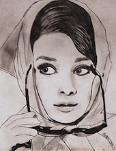
I am ever so happy to report that Jessica Simpson has finally been dropped from her country label. When she first started this whole thing I warned her, "No one likes you. We all like Carrie Underwood so much more. Don't even try. We're all going to laugh at you." 

Seriously though, she said crap about Carrie Underwood (THE ACM ENTERTAINER OF THE YEAR!) and expected to create a successful country music career. Are you an idiot? ... Yes. But stop using that as an excuse.


Monday, April 6, 2009

Critique Three

Juked is an online literary journal that publishes fiction, poetry, and photograpghy; however, there was little photography to be found on the site. Juked has been in publication since 1999, and says that they don't "adhere to any particular themes or tastes." This literary journal is updated two to three times a week, and there is also an annual print edition.

I was most surprised to learn that contributors to this literary journal have been anthologized in W.W. Norton's New Sudden Fiction and Dzanc Book's Best of the Web. I was immediately drawn to this literary journal because the icon didn't seem very scholarly. I wanted to review a journal that didn't immediately strike me as boring.

The publications on Juked are full of talent, and it seems like this is an effective platform for creative work, since many of the contributors have been recognized. My only complaint is that none of these works take advantage of the digital format. This journal might as well be in print. The only reason it is on the web is probably because print costs more money, and because they do so many updates. The publications almost look like a page from a book. They are very plain and the text is standard. I suppose this is because the contributors aren't just aspiring to be published online, and want their work to translate into print easily. I enjoyed the online works from my first critique much more. I guess I just feel that if something is published online, then there should be links and hovers...or anything to add excitement to the text. There are so many things that can be done to digital formats, and I just feel like Juked didn't do anything.

The thing I liked msot about Juked is that they state in their info "your work will always remain yours." Until this class, I didn't think about rights. If I ever actually wrote something... and someone actually wanted to publish it, then I would want the rights to my own work. Juked asks for first-and-one-time and archival rights. That sounds like a fair deal to me. However, the chances of me writing something that Juked would even consider publishing is slim to none. The works in this journal are very refined, and I have never written anything. Ever. Unless Juked does an issue about literary analysis papers, I am pretty sure I will never be featured on this site. But, if the oppurtunity ever presented itself, I would want to be published on this site.

Overall, Juked had great work on their site, but I would have liked to see more photography and more use of digital formats.

Group

I am in a group with George and Jonathan. We're no New Kids On the Block, but we're still pretty cool. Maybe more like Hanson than anything.